
Your network has many moving parts, and it’s important to track them to ensure your network’s health, maintenance, and success. But it can be challenging to manage all your network’s devices and data flows, not to mention keeping your network updated and working through performance issues. It’s important to have some form of network visualization in place, which typically means creating a topological map or diagram.
You can manually create a network visualization, but I don’t recommend it. Instead, think about using network mapping visualization software—it’s a faster, simpler, and more accurate way to build an IT network visualization.
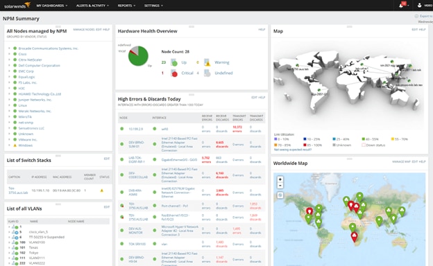
My personal favorite software is SolarWinds® Network Topology Mapper (NTM), which enables you to automatically create and update network maps, then export those maps and other raw data to various applications. If you’re looking for network visualization in the context of more comprehensive monitoring, check out SolarWinds Network Performance Monitor (NPM), which offers even more network scanning features, such as speedy identification and diagnosis of network performance issues.
- What Is Network Visualization?
- How to Read and Understand a Network Visualization
- How to Quickly Visualize a Network
- Recommended Tools for Network Visualization (Free Trials)
- Start Quickly With IT Network Visualizations
What Is Network Visualization?
Network visualization is the practice of creating an “illustration” of your network, whether it’s a map, diagram, or drawing, to display the arrangement of specific network elements. With a network visualization, you can more easily get an overview of connections between servers, routers, workstations, and more, whether those connections are hardwired or describe data flows. Some maps also offer real-time insight into node status as well. This not only helps you better understand your network, but also enables you to easily catch, identify, and address critical health and performance issues in your network.
Network visualization can also be known as network mapping, network map visualization, network graph visualization, and network topology mapping. No matter what you call it, network visualization is crucial for gaining insight into your network and maintaining optimal network performance. It offers the kind of visibility and intuitive understanding a spreadsheet or chart just can’t match.
How to Read and Understand a Network Visualization
Before you become further involved in the network visualization process, I’ll get into a little more detail about the various kinds of network map visualizations. To start, there are three main categories of network maps:
Physical Network Visualization
Similar to a building’s floor plan, a physical network visualization focuses on the concrete elements of a network such as its literal cables, devices, and terminations. This kind of topology map is usually used by engineers, and it’s the most difficult kind of network graph to generate automatically.
Logical Network Visualization
Also known as signal network visualization, this type of network visualization focuses on the inner workings of a network by highlighting data behavior. Logical network visualizations offer a greater range of use cases and are popular because their clear representation of data movement offers admins key insights into bottlenecks and other issues.
Functional Network Visualization
This kind of network visualization focuses on applications specifically, demonstrating how application traffic passes through a network. Because functional topology mapping represents the flow of application traffic logically instead of physically, it’s sometimes grouped with logical network visualization.
For all these types of visualizations, you’ll be mapping specific network elements, also known as nodes. Nodes that interact are connected with lines on the network graph and are sometimes accompanied by directional arrows representing data flow. On a network graph, nodes can be represented by circles or other shapes, and some programs allow you to customize your node’s image according to your needs.
Let’s dive a little deeper into the aspects of network map design. There are six different core layouts, known as topologies, you can use to arrange the nodes of your network graph visualization:
Star Topology
This topology contains one central node, and connecting nodes branch off in a star shape.
Tree Topology
Multiple branches stem from one core branch, similar to leaves stemming from a tree branch. If one of the branches encounters an issue, the rest of the network will still function.
Mesh Topology
Like a ladder, all the nodes are connected to each other. Mesh topologies supply high failover protection; if one node goes down, the network can properly reroute the flow of data.
Ring Topology
In this topology, nodes are arranged in a circle with data flowing in one or both directions.
Bus Topology
Nodes in a bus topology are arranged in a straight line, and data flows through the network one device at a time.
Hybrid Topology
You can mix and match different topologies, or even combine all of them together, to create a hybrid topology.
When determining which network visualization software is right for you and your business, it’s important to consider which kind of IT network visualization best fits your needs. Often, you’ll have to implement multiple types of network visualization to create a network map representative of your nodes and the flow of network traffic between them.
How to Quickly Visualize a Network
To visualize your network, you must use a network map, diagram, or drawing. Good network visualization tools will allow you to clearly understand, update, and share information relative to your network. But they also allow you to do so quickly, with features designed for a fast map-building process and a clear interface designed for easy interpretation.
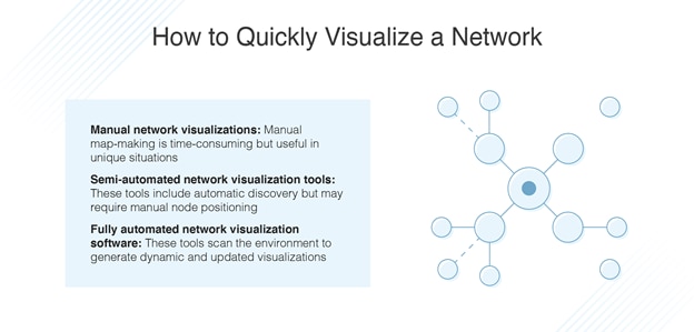
You can manually create your own network map visualization, but it’s a time-consuming and resource-draining process. Even the most careful person can make a mistake while creating a network visualization, which can result in nasty errors. For this reason, the easiest—and quickest—way to visualize your network is to invest in a network visualization tool.
Depending on the network mapping visualization tool you choose, one of three techniques will be used to visualize your network:
Manual Network Visualizations
It’s good to know how to create manual maps. Fully manual diagrams are time-consuming to create, but you can use this skill to help generate complex maps in unique situations.
Semi-Automated Network Visualization Tools
These allow you to automatically discover your network’s devices, but you’ll still need to position and connect your nodes manually.
Fully Automated Network Visualization Software
Network visualization tools are made to respond to your network environment automatically, scanning the environment to generate dynamic and complete network graph visualizations that can show node status as well.
Regardless of whether you elect to create maps manually, semi-automatically, or automatically using a network visualization tool, make sure your network visualization software allows for change and movement. Static network visualizations—visualizations that don’t track a network’s changes—become outdated almost immediately. The best IT network visualization maps are constantly adjusting to account for your network’s ever-changing nature, and the best network mapping visualization tools automatically take these changes into account, so you always have an updated view of your network.
Recommended Tools for Network Visualization (Free Trials)
I recommend using SolarWinds Network Topology Mapper (NTM) if you’re looking for a straightforward yet effective network visualization tool. Not only is NTM designed to cohesively map your IT infrastructure, but it also enables you to build multiple maps from different perspectives with a single scan. And while these maps are generated automatically, it’s easy to edit nodes on your network visualization individually or as groups.
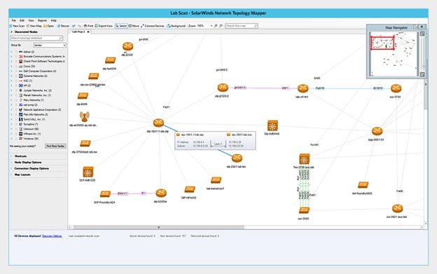
NTM allows you to create multiple maps from a single scan and enables you to export those maps to common formats such as Microsoft Visio, PDF, and PNG files. SolarWinds NTM also enables you to schedule periodic re-scans of your network and automatically update your network visualization with newly discovered topological information. You can also elect to manually update your network visualization whenever you choose, and with this option NTM helps keep your database up to date for instant refurbishment.
Another wonderful network visualization software is SolarWinds Network Performance Monitor (NPM). NPM is more comprehensive than NTM, as scanning your network for visualizations is just one of its features. It’s also built to provide you with the insights you need to troubleshoot network issues such as outages, delays, and vulnerabilities, helping you quickly move from detections to diagnostics to resolutions. NPM is designed to automatically alert you when troubles arise, and you can view various metrics on a common timeline using the PerfStack™ dashboard. Another great feature of NPM is the hop-by-hop analysis provided by the NetPath™ feature. Both SolarWinds tools are built to meet PCI compliance, FIPS 140-2, and other regulations.
Intermapper is another excellent option for building network visualizations, as it offers powerful tools along with lots of customizability. You can draw your own network maps using unique topologies, and further customize network visualizations using templates, colors, and animated node icons. Intermapper is designed to monitor network visualizations in real time, continuously reflecting changes in inventory or topology. Autodiscovery features also help keep your maps up-to-date and can be used to create physical and logical network visualizations. However, the tool doesn’t let you export these visualizations live to other applications. Intermapper offers a pay-by-device plan, as well as a limited 30-day free trial.
Start Quickly With IT Network Visualizations
Network visualization tools are incredibly useful for network admins who need a fast way to understand their network and what’s going on with it. With options for multiple map generation, node icon organization, and inventory production, SolarWinds NTM helps you assess the connections within your network and keep a watchful eye on your network’s well-being. For even more network map visualization benefits, such as creating built-in alerts and troubleshooting performance issues, use SolarWinds NPM to maintain your network’s health and success. SolarWinds offers free trials for both programs—access the NTM 14-day free trial here and the NPM 30-day free trial here.
*As of March 2021