
With more people than ever accessing websites via their mobiles, delivering a high performing site and top user experience for your mobile users is a must. But with best practice for mobile web performance constantly changing, it can be hard to know what strategies you should implement to ensure your site stays ahead of the game.
In this article, we discuss five best practices to help you improve the speed and performance of your website, as well as help your site rank well in mobile search results:
- Keep it Minimal
- Focus on Speed
- Use a Monitoring Tool
- Follow Google’s Mobile First Indexing Best Practice
- Use AMP (formerly known as Accelerated Mobile Pages)
By the end of reading, you’ll be armed with actionable tasks and best practices focusing specifically on mobile web performance.
Keep it Minimal
No one wants to view a cluttered page – something particularly true when you’re viewing a web page through a tiny mobile screen. So keeping your website design, and content, clear and concise, is a must for any successful site.
A minimalist website design and layout helps visitors relax, and enjoy the experience on your website. Importantly, a site with a minimal design, with an intuitive user interface, will lead to more time on site, which ultimately increases the chance of conversions against your business’s goals.
Top tips to minimize your website design include:
- Navigation – By using clear signposting, users can easily navigate your website and find the information they need. Make sure the menu is easily accessible on a mobile device, and highlight key buttons to ensure users know where to click next.
- Colors – Keep the numbers of colors you use to a minimum (between 2 and 3). Bright colors can work in a color scheme, but are often better combined with whitespace to stop them from being too overpowering on a small screen.
- Images – Choose images relating to your site and will engage your target audience. Make sure the images aren’t too small or have low resolution on the mobile version of your site.
A minimal design will also improve mobile loading times, which we’ll consider next.
Focus on Speed
Google has found 53% of mobile site visits leave a page if it takes more than three seconds to load. Therefore, ensuring your site loads quickly on mobile devices should be a key focus.
There is much you can do to ensure a fast, streamlined loading process. Top tips include:
- Compress Images – Large images can take a long time to load, especially on mobile. Use an image optimization tool to quickly and easily compress the images on your site, which can make a big difference to speed.
- Optimize and Minify CSS and JavaScript Files – Minifying CSS and JavaScript files involves stripping out any irrelevant code, including white space and new line characters, helping to reduce page size and create a lightweight website.
- Gzip Resources – Compress your site’s files to improve performance and load times. By enabling Gzip compression, any requested pages will be compressed before being sent to users, which significantly reduces its size, and consequently transfer speed.
All of the above processes are easy to implement, and will significantly improve page speed on all devices.
Use a Monitoring Tool
Using a monitoring tool to track not only page speed but also website availability is another key practice to help improve your site’s mobile performance. By monitoring how your website is performing on mobile devices, you can check to ensure your website is fully functional and providing a top experience for your mobile visitors.
SolarWinds® Pingdom® is an online monitoring tool allowing you to track your mobile web performance, and giving you insight into what aspects of your site need to be improved.
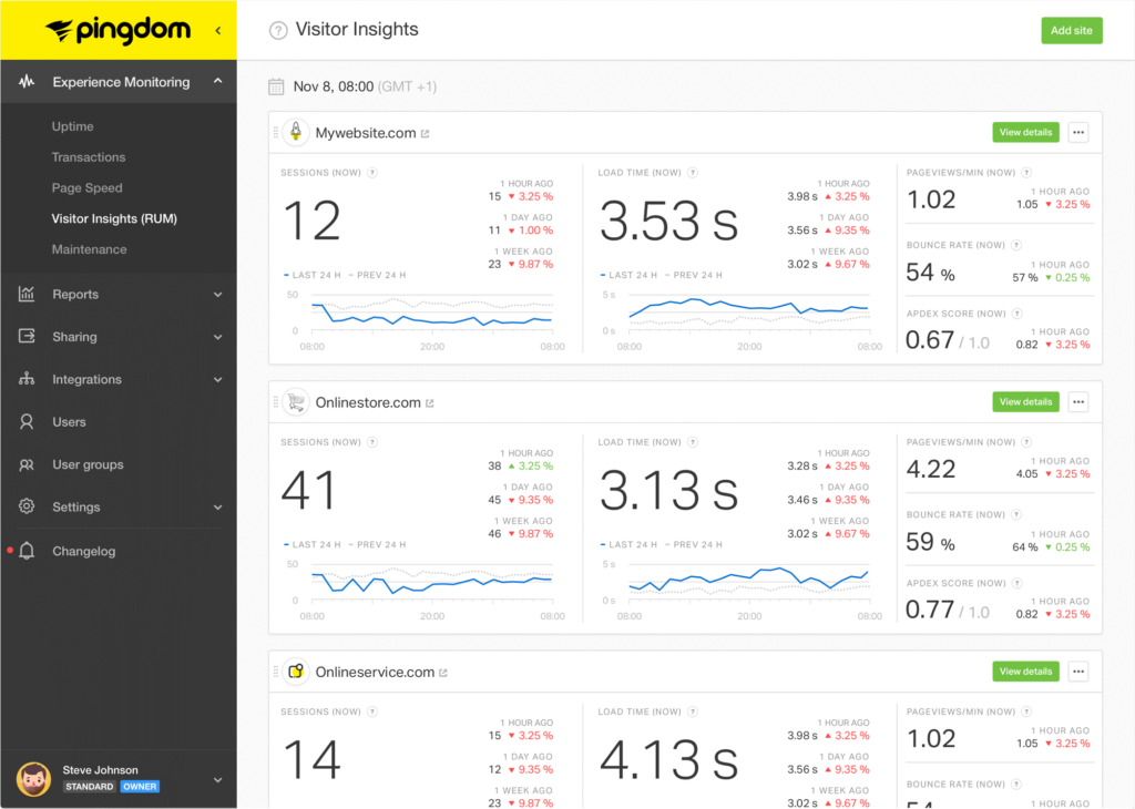
- Page Speed Monitoring – Track page load times for mobile users and find out which page elements are affecting speed. Pingdom provides aggregated performance grades summarizing the results of every test, and a detailed overview of every stage of the loading process, including image download speeds, SQL query execution times, script errors, and more. This data will enable you to identify any bottlenecks and other issues affecting site speed.
- Real User Monitoring (RUM) – Analyze how real users interacted with your website and the experience they received. RUM allows you to filter data, giving you insight into load times on mobile devices and how they compare to desktop, and how speed differs depending on the geographical location of your users. This information can be used to identify where, when, and why your site is consistently underperforming.
- Website Outage Checker – Pingdom will monitor your server up to every 60 seconds, from over 100 data centers worldwide, to test for availability. If your site goes down, Pingdom will immediately send you an alert via SMS, email, or a selection of apps, such as Slack. You can then quickly rectify the problem, keeping user disruption to a minimum. Pingdom will also monitor transactions on your website, including sign up forms and the checkout process. Again, if an issue is detected with one of your transactions, Pingdom will alert you, so you can quickly fix the issue.
Evidently, tracking your mobile web performance is a must. By having a clear understanding of how your website is performing, and what issues are causing poor load times, you are then best placed to implement strategies to improve the user experience on your site.
Follow Google’s Mobile First Indexing Best Practice
Mobile first indexing is Google’s practice of evaluating and ranking a site’s mobile version before a desktop version for Search results. Since 2019, by default Google has crawled and indexed all new sites with the Smartphone Googlebot. This helps Google ensure all content displayed in mobile Google Search results is optimized for mobile devices.
Best practices for Google’s mobile first indexing include:
- Ensure Googlebot Can Access your Content – Make sure you use the same meta robot tags on both mobile and desktop versions of your site. Otherwise the Smartphone Googlebot may fail to crawl and index your mobile pages.
- Desktop and Mobile Versions Should Contain the Same Content – As almost all indexing will come from the mobile version of your site, it’s important it contains equivalent content to the desktop version.
- Check Your Structured Data – Both your mobile and desktop sites should have the same structured data. On the mobile version, you’ll also need to update the URLs in the structured data to the mobile URLs.
- Placement of Ads – Adverts can severely damage user experience, for example full screen ads, or sticky ads obstructing the screen, which in turn can affect your mobile page ranking in Google. If you’re displaying ads on your site, check out Ad Standards to ensure you’re following best practice.
By implementing the above strategies for Google mobile first indexing, your site should see an improvement in user experience and mobile search rankings.
Use AMP (Formerly Known as Accelerated Mobile Pages)
The AMP project is an open source initiative originally developed by Google and Twitter. Known in its infancy as Accelerated Mobile Pages, one of the project’s goals was to help create optimized mobile web pages.
AMP is an HTML framework providing a way to create fast, smooth loading pages to prioritize user experience. In fact, the Washington Post saw a 23% increase in returning users from mobile searches due to AMP.
Benefits of using AMP pages include:
- Page Load Times – AMP pages “load near instantly” across all devices and platforms. Improved page speed can lower bounce rates, increase time spent on site, and ultimately boost conversions.
- Google Search – Although AMP itself isn’t a ranking signal, mobile web page speed is. Therefore, by using AMP and improving mobile loading times, your site should benefit from higher rankings in the search engines.
- Google Rich Results and Carousels – AMP pages can be featured on mobile search as part of rich results and carousels (for relevant content and pages).
WordPress, Drupal, and Joomla, all have plugins and extensions enabling you to generate AMP versions of your web pages. Equally you can code your own AMP HTML web pages.
Final Thoughts on Mobile Web Performance
Evidently, there’s much you can do to improve your mobile web performance. By following Google’s best practice, monitoring your website, and focusing on improving speed and performance issues, you can help ensure your site provides a high quality user experience for your visitors, on both mobile and desktop.
Have you got any questions on how to improve mobile web performance? If so, please ask away in the comments below.